Tanabata was called "Qiaoqiao", and the ancient women's party put on the fruit to worship the gods on this day, begging the goddess of heaven to give them a bright heart and dexterous hands, to make their knit women red skills, and more pleading for the marriage of love and marriage. Skillfully matched. With the changes of the times, Qixi Festival has been given more romantic love, especially today, Tanabata has become a Valentine's Day enough to be equivalent to the Western "2.14".
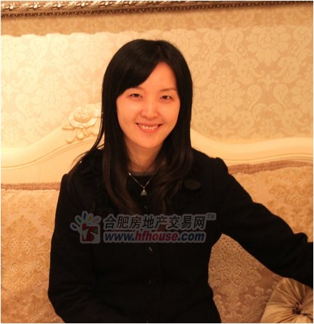
Dong Yi Risheng decorative beauty designer Miss Guo Weixing
On the Qixi Festival, it was very appropriate to discuss the topic of wedding room. So today, Xiaobian invited Miss Guo Weixing, the beautiful beauty designer of Hefei Dongyi Risheng Decoration Co., to explain the soft dress of the wedding room. With the matching skills, Dongyi Risheng Decoration is the leader in the industry and has always been the advocate of quality home decoration. Therefore, the master of soft decoration of Dongyi Risheng also gave very professional and innovative suggestions.
Miss Guo has a very keen insight and control over color. She told Xiaobian that the world is full of color, so life is inseparable from color. Color can change our mood and affect our understanding and psychological feelings about things. A set of successful color matching designs will directly bring people a strong visual impact and convey the owner's personality preferences.
Therefore, in the design of wedding rooms, grasping the personality needs of newcomers is undoubtedly a challenge to the color design and aesthetics. Miss Guo introduced: "In most consumer thinking, the wedding room decoration must be based on the festive red color, but compared with the current young people, the pursuit of diversified personalization, color matching has gradually become their The primary choice, but also in the wedding room, I hope that their wedding room in addition to the festive atmosphere, layout should be beautiful and comfortable, but also full of personality."
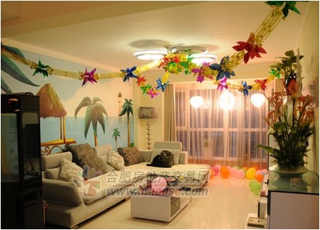
So how do you match colors in wedding room decoration? The most common color combinations in wedding room decoration are as follows:
1, red + yellow = happy
The red color of the wedding room decoration is the traditional color of the new house in China, but now many young people feel that it is very tacky to use red in a large number of new houses. In fact, as long as you take care of it, it is easy to achieve the finishing touch with red as the embellishment. Red + yellow is a very good match. The whole room is dominated by yellow, with red lighting and other accessories, so that in a romantic and warm atmosphere, it can bring out the joy and passion of the wedding. And if this red lighting is not desired in the future, it can be replaced with other colors. It will also give the living room an unusual atmosphere.
2, yellow + green = fresh and refined
In fact, there is no constant vulgarity and elegance in the design. The key lies in the accurate grasp of color. Nowadays, many young people like to use yellow and green to create a wedding atmosphere in the wedding room decoration. Because yellow is a fresh, fresh color; green is a calm color that makes people feel calm inside, can neutralize the lightness of yellow, and make the space stable. Therefore, such a color matching method will make the entire space have a sense of jumping of color without losing stability.
3, blue + white = romantic warmth
Many people have thought about using some bold attempts when decorating their wedding room, but they are afraid that the effect will not be very satisfactory. They give up the attempt and most people will choose the white instead. In fact, just add some blue in this white, because blue symbolizes calmness, harmony and calmness. Moreover, this not only avoids the kind of empty feeling that a large area of ​​white gives you, but also can also celebrate the festive feeling of wedding room decoration, and also make the wedding room decoration more fashionable.
These three combinations are the most commonly used color combinations in wedding room decoration. The wedding room is a festive place, so its color requirements are also very strict. No matter what kind of matching scheme is adopted, the premise is that it must be "harmonious". Following this principle, combined with the style of the entire wedding room decoration, create a stylish and festive wedding room decoration.
East Yi Risheng beauty designer details wedding room decoration color matching restricted area
In fact, many of my friends also like to use their own methods to design their own houses. However, at this time, because of the lack of professional knowledge and the lack of mastery of color matching, there are often many uneven color transitions. Here, Miss Guo also explained the taboos in color matching for everyone. Let's take a look!
1. Don't decorate the restaurant with blue
Blue is a fascinating color. Traditional blue is often the embodiment of the tropical style of modern decorative design. Blue also has the effect of regulating nerves, calming and calming the nerves. The blue is fresh and elegant, and it is also very eye-catching with various fruits, but it should not be used in restaurants or kitchens. The food on the blue table or placemat is always better than the appetite in warm colors. At the same time, do not install incandescent lamps in the restaurant. Or blue mood lights, scientific experiments have shown that blue light will make food look unattractive. However, as a bathroom decoration, it can enhance mystery and privacy.
2, black and white contrast
The black and white rooms are very modern and are the first choice for some fashion people. However, if you use black and white in the room, it will be too fancy. In this environment for a long time, it will make people dazzled, nervous, and irritated, making people feel at a loss.
3, purple will give space to suppress
Purple, the feeling of people seems to be quiet, fragile and slender, always giving people unlimited romantic associations, the pursuit of fashion is the most admired purple. However, a large area of ​​purple will make the overall tone of the space deeper, resulting in a sense of oppression.
It is recommended not to be placed in a room that requires a cheerful atmosphere or in a child's room, which will make the person in it feel helpless. If you really like it, you can use it as a decorative highlight in the part of the living room, such as the corner of the bedroom, the curtain of the bathroom and other small places.
4, pink will bring irritating emotions
Pink, heavy use is easy to make people upset. In order to adjust the atmosphere of the new home, some newlyweds like to make romance with pink. However, the thick pink will make people's spirits always in a state of excitement. After a period of time, the people who live in them will have an inexplicable heart, easy to squabble, and cause irritability. It is recommended that pink appear as an embellishment of the interior decoration, or dilute the concentration of the color, and a light pink wall or wallpaper can make the room warm.
5, do not decorate the room with a single gold
The golden brilliance reveals a bold and flamboyant personality, and the vision will be clean under the sleek white. But gold is one of the most easily reflected light colors. The golden environment is the most harmful to people's sights. It is easy to make people nervous and not easy to relax.
It is recommended to avoid the use of a single golden decorative room on a large area, which can be used as a decorative color on wallpapers and soft curtains; on the bathroom wall, a golden mosaic can be used with cool white or stainless steel. In order to make the environment of the living room more affable, you can put some green potted plants in the corner to make the room full of fun.
6, don't use yellow in the study
Prolonged exposure to high-purity yellow will give people a feeling of laziness, so it is recommended to embellish some in the guest room and restaurant. Yellow is the most unsuitable for use in the study. It will slow down the thinking.
7. Brown is not the ideal color for restaurants and children's rooms.
The brown color is neutral and warm, it is elegant, simple, solemn and elegant. It rejects the cheesy of gold tones, or the monotony and mediocrity of ivory. Coffee itself is a more subtle color, but it will make the restaurant dull and melancholy, affecting the quality of the meal; it should not be used in children's rooms, the dull color will make the child's character depressed; also remember that brown is not suitable for black .
Frying Basket Strainer,Deep Fryer Strainer Basket,Fryer Mesh Basket,Stainless Steel Fry Basket
HOMEARTS INDUSTRIAL CO.,LTD , http://www.homeartschina.com